


Client
Pharmceutra
Role
UI & Graphic Designer
Duration
4 Weeks
Tools
Figma, Photoshop, Jira, Illustrator
Deliverables
Email Newsletters, Promotional Emails, Product Campaigns
Project Overview
Creating a clearer, more accessible healthcare shopping experience
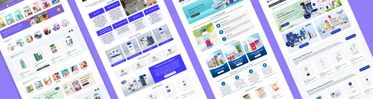
Pharmceutra is a UK-based healthcare platform offering pharmacy, healthcare, and medical products. The redesign focused on simplifying how users discover products, understand healthcare information, and move through the website across different devices.
The aim was not simply to modernize the interface, but to create an experience that feels clear, trustworthy, and easy to navigate, especially for users who may already feel overwhelmed when searching for healthcare products.
About The Project
The existing Pharmceutra website contained a wide range of healthcare products and information, but the overall experience made it difficult for users to quickly understand where to go or what action to take.
The redesign focused on reorganizing information, simplifying navigation, improving product discovery, and introducing a more consistent visual system across the website.
View Web Prototype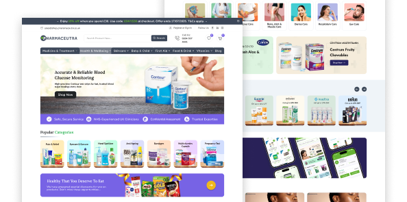
The Challenge
The previous website had usability issues that made the experience less clear and engaging. The main challenges were an outdated design, complex navigation, unclear content hierarchy, and limited mobile usability.
Project Goals
The redesign aimed to simplify navigation, improve readability, and create a more consistent user experience. It also focused on building trust and ensuring a smooth, responsive experience across all devices.
Design Thinking Process
The Design Thinking Process is a user-centered approach to solving problems through understanding, exploration, and continuous improvement. It focuses on understanding users’ needs, identifying key challenges, exploring possible solutions, and testing ideas to create experiences that are both useful and meaningful.

Empathize
User Interview
Empathy Map
User Pain Points
User Persona
User Stories
User Journey Maps

Define
Problem Statements
Hypothesis Statements
Value Proposition
Competitive Audit
Benchmark

Ideate
Goal Statements
Brainstorming (HMW?)
Storyboards
User Flows
Information Architecture
Low-Fidelity Wireframes

Prototype
Medi-Fidelity Wireframes
Design System
High-Fidelity Wireframes
Mockups
Interactive Prototypes

Text
UX Research Study
UX Research Plan
Usability Study
Affinity Diagram
Want to explore the complete UX process?
All research was presented to my client in a slide deck
View Full UX ResearchFrom Insight to Solution
Turning user insights into meaningful design decisions.
Users struggled to find information
Simplified navigation and restructured the information architecture.
Pages had too much information
Improved content hierarchy using clean, scannable layouts.
Lack of visual consistency
Created a consistent UI system with reusable components.
Before → After
Turning user insights into meaningful design decisions.
Before
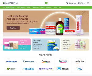
- Cluttered layout
- Confusing navigation
- Inconsistent UI
- Weak call-to-action visibility
- Poor spacing
- Limited mobile usability
After
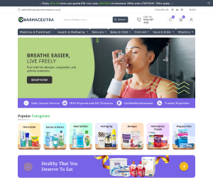
- Modern & clean interface
- Simplified navigation
- Consistent design system
- Clear visual hierarchy
- Better readability
- Fully responsive experience
What This Project
Taught Me
This project strengthened my understanding of how thoughtful information architecture and visual hierarchy can simplify a complex healthcare e-commerce experience. It also helped me improve my approach to responsive design, reusable components, and turning research insights into practical design decisions that make the shopping journey clearer and easier for users.