


Client
AHP Medicals
Role
UI/UX & Graphic Designer
Duration
3 Weeks
Tools
Figma, Photoshop, Jira, Illustrator
Deliverables
Website Redesign, Responsive UI Design, Design System, Wireframes, Interactive Prototype
Project Overview
AHP Medicals Website Redesign
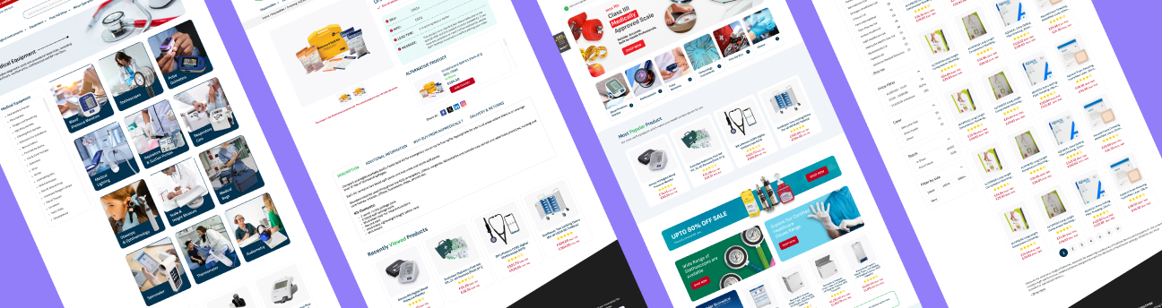
AHP Medicals is an online healthcare store offering medical equipment and supplies for individuals, healthcare professionals, and care teams.
I redesigned the website to create a cleaner, more modern, and easier-to-navigate shopping experience. The focus was on improving product discovery, simplifying navigation, strengthening visual hierarchy, and making important information easier to understand.
About The Project
AHP Medicals already had an established online store, but the overall experience felt dated and information-heavy.
The redesign gave me an opportunity to rethink how customers interact with the website, from discovering medical supplies to comparing products and moving toward checkout.
I focused on creating a visual experience that feels modern, trustworthy, organized, and approachable, while keeping the needs of both individual customers and healthcare professionals in mind.
View Web Prototype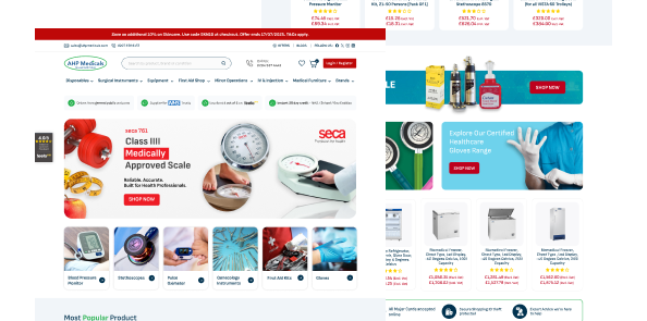
The Challenge
The main challenge was to create a more structured experience without removing the depth of information customers need when choosing medical equipment & supplies.
Key challenges included:
 Making a large product catalogue easier to explore.
- Improving navigation and content hierarchy.
- Making product information easier to scan.
- Creating clearer paths from browsing to purchasing.
- Building a more modern and trustworthy visual experience.
Project Goals
The redesign focused on making the website simpler to understand & easier to use.
I focused on:
- Create a clearer structure that helps users find relevant products quickly.
- Make categories, search, filters, and product listings easier to explore.
- Organize information so users can quickly identify what matters most.
- Create a professional healthcare-focused visual language that feels reliable & reassuring.
- Make the transition from product discovery to cart and checkout more straightforward.
Design Thinking Process
I followed a simple human-centered approach:
Understand
I looked at the existing experience, studied user needs, and analyzed pain points to truly understand the problem.
Define
I identified key issues and defined the right problems to focus on for meaningful impact.
Explore
I explored different visual and structural solutions through ideation, layouts, and user flows.
Design
I designed clean, intuitive screens with a consistent visual language and clear user experience.
Refine
I refined the designs based on feedback, ensuring consistency, usability, and a seamless overall experience.
Want to explore the complete UX process?
Take a closer look at how I moved from understanding the existing experience to defining problems, exploring solutions, and refining the final interface.
From Insight to Solution
The redesign translated key observations from the existing website into practical UX improvements.
Information-heavy experience
Clearer content hierarchy
Difficult product discovery
Improved categories, search, and filtering
Outdated visual style
A fresh and modern interface
Inconsistent layouts
A more structured and consistent design system
Complex shopping journey
Clearer paths from product discovery to checkout
Before → After
Turning user insights into meaningful design decisions.
Before
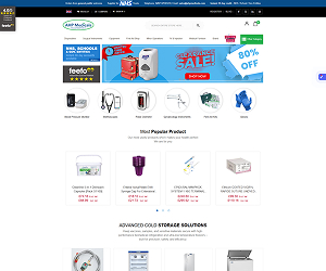
- Cluttered layout
- Confusing navigation
- Inconsistent UI
- Weak call-to-action visibility
- Poor spacing
- Limited mobile usability
After
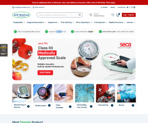
- Modern & clean interface
- Simplified navigation
- Consistent design system
- Clear visual hierarchy
- Better readability
- Fully responsive experience
What This Project
Taught Me
This project strengthened my understanding of how thoughtful UX and visual hierarchy can
transform a complex healthcare e-commerce website into a simpler and more approachable
experience.
It also helped me improve my approach to information architecture, responsive
design, reusable components, and translating user needs into practical design decisions.
Most importantly, I learned that a successful redesign is not only about creating a visually
appealing interface. It is about making information easier to understand and helping users
complete their goals with greater confidence.