


Client
AHP Medical
Role
UI & Graphic Designer
Duration
3 Weeks
Tools
Figma, Jira
Deliverables
Mobile App Redesign, UI Design, Design System, Interactive Prototype
About The Project
AHP Medical provides medical equipment and healthcare supplies for individuals and healthcare professionals.
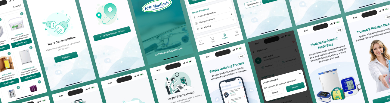
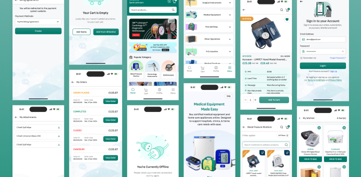
I redesigned the existing mobile app to give it a fresh, modern, and colorful look while making the overall experience easier to understand and navigate.
The redesign focused on the homepage, navigation, buttons, backgrounds, sign-in and sign-up screens, product experience, cart, wishlist, and profile.
The Challenge
The existing app had all the basic features needed for medical shopping, but the overall design felt a little outdated.
The main challenges were:
 Outdated visual style & limited use of color
- Navigation needed improvement
- Homepage needed a stronger visual hierarchy
- Buttons & Components needed improvement
- Sign-in and sign-up screens needed a more modern look
- Need to improved the way products and their information are presented.
Project Goals
The goal was to modernize the existing app without changing its core purpose. Before starting the redesign, I defined a few simple goals.
I focused on:
- Give the existing app a fresh visual style that feels current.
- Add color without overwhelming the experience.
- Create better spacing, alignment, and visual hierarchy.
- Make important sections easier to find.
- Make buttons, cards, icons, typography, & other elements feel like part of the same design system.
Design Thinking Process
I followed a simple human-centered approach:
Understand
I looked at the existing experience, studied user needs, and analyzed pain points to truly understand the problem.
Define
I identified key issues and defined the right problems to focus on for meaningful impact.
Explore
I explored different visual and structural solutions through ideation, layouts, and user flows.
Design
I designed clean, intuitive screens with a consistent visual language and clear user experience.
Refine
I refined the designs based on feedback, ensuring consistency, usability, and a seamless overall experience.
Exploring the Complete UX Process
I worked through the key stages of the redesign, from understanding the existing app to defining the structure, creating the visual direction, developing the design system, and applying it across the final screens.
Explore Complete UX Process* View the detailed case study presentation to see the complete design process.
From Insight to Solution
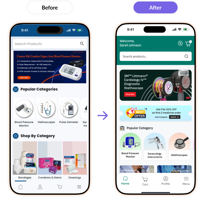
The redesign turned the key observations from the existing app into practical design improvements.
Outdated visual style
A fresh and colorful interface
Unclear navigation
A simpler navigation structure
Basic homepage
A more engaging and structured homepage
Inconsistent UI
A consistent design system
Older authentication screens
A modern sign-in and sign-up experience
Basic product presentation
Clearer product layouts and hierarchy
What This Project
Taught Me
This project taught me that a redesign is not always about changing everything. Small but thoughtful changes in color, layout, navigation, typography, spacing, and components can completely change how an existing product feels. It helped me understand how to give an existing product a new visual direction while keeping the experience familiar and easy to use.